
Drummond Geometry Explained
Named after Charles Drummond, a famous Canadian technical analysis trader, Drummond geometry is just another way to look at markets using a technical eye. Originally, the ultimate goal using the Drummond geometry was to find the yearly high and yearly low in a financial security, but this was way before Forex trading even existed.
Today’s traders have access to a multitude of timeframes and currency pairs and the original concept transformed into finding support and resistance areas on various timeframes. As such, by using Drummond geometry, traders find out such areas that prove to give high-probability trading setups.
To start with, we must mention that this is just a brief explanation of the overall Drummond geometry principle. The concept evolved over time and various trading methods and indicators derived from the Drummond concept.
Hence, the aim here is to understand the core of it, the initial support and resistance levels Drummond found on all timeframes. From that moment on, the concept evolved into what we know today as the Drummond geometry.
General Drummond Concepts
Charles Drummond looked at markets through a unique perspective. He strongly believed that:
- the prices of any security move and change as the market unfolds
- charts are nothing but a representation of crowd psychology
- support and resistance on various timeframes are interconnected
- if a pattern appears on one timeframe, it can form on other timeframes too
The beauty of the Drummond concept consists in its ability to predict the future market state based on the current one. As such, traders identify reliable support and resistance levels.
Predicting the State of the Market Using the PL Dot
The core of the Drummond geometry is the PL Dot. Also known as the Drummond Dot, it was developed as Drummond searched for a way to distinguish between trending and ranging conditions.
For the ones wondering where the PL comes from, the acronym comes from point and line. Tellingly, the PL Dot is a point or an average calculated based on historical prices. By using a line and connecting the points, a sort of moving average appears on the chart.
However, this PL Dot line is not any kind of average. Because of the way the PL Dot is calculated, it differs from most moving averages used in today’s technical analysis.
Calculating the PL Dot
The starting point in using the PL Dot concept is to know how to calculate it. The rule says that the PL Dot averages the average of the last three candlesticks highs, lows, and closing prices.
Sounds confusing? Well, it’s not that complicated if we use a chart to explain the formula.
Here’s the USDJPY weekly timeframe. While the current candle is still open, we’ll calculate the PL Dot for the current candle using the previous three candlesticks.
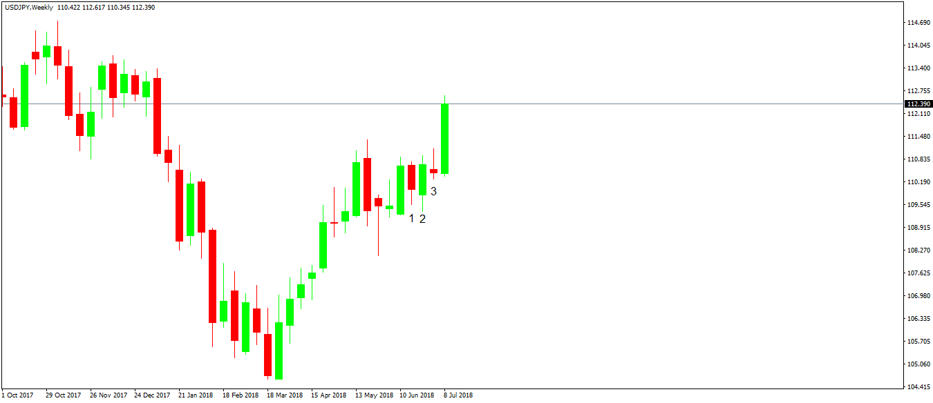
For a more straightforward interpretation and understanding, we’ve labeled the last weekly candlesticks that already closed with the numbers 1, 2 and 3. Next, we need to find out the high, low and closing values for each candle.
Here they are:
- 1st candlestick: high – 110.75; low – 109.54; close – 109.97
- 2nd candlestick: high – 110.93; low – 109.36; close – 110.67
- 3rd candlestick: high – 111.12; low – 110.26; close – 110.44
With that, we have everything needed to calculate the PL Dot or the Drummond Dot for the current candlestick that is still open. The thing is to average the three values corresponding to each candle, take the sum of the three results, and divide them by three again.
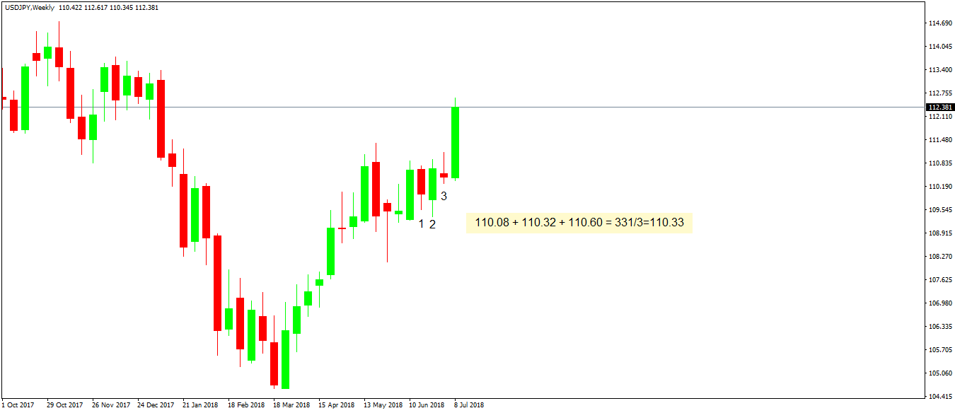
The image above is self-explanatory. The first three numbers represent the average of the high, low and closing values for each candle.
Next, the sum is divided by three. And that’s the Drummond Dot, or the PL Dot corresponding to the current open candle (the big, green candle).
We won’t plot a point on the MT4 for the simple reason that the platform doesn’t allow to put a specific value on it. Instead, we’ll use a line as we can set the parameter for it exactly at the PL Dot value. Or, 110.33.
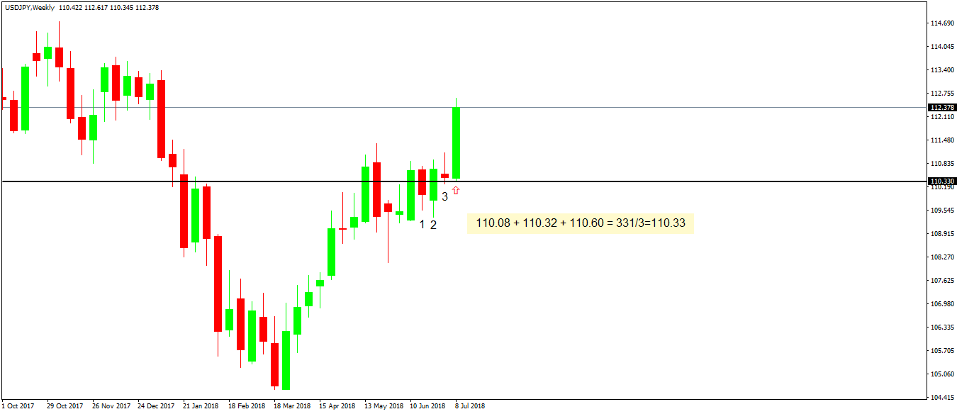
The black line above represents the PL Dot and shows, as Drummond intended, future support for the next period. The low of the current candle was 110.34, one pip above the PL Dot. How cool is that?
Drummond Line
So far, we’ve shown how one PL Dot offers tremendous support level. The formula to calculate it is the same on all timeframes and for all currency pairs.
Maybe there is an indicator that plots the PL Dots automatically. If there is, it can easily be imported via the MT4 custom indicators feature.
But more important is to understand how to calculate it as it proves to be a valuable source of future support and resistance. As always when it comes to support and resistance, the bigger the timeframe, the better.
One point, though, is not enough for a trend. Now that you know the method to calculate the PL Dot, a line or average that connects the PL Dot can be plotted on the screen.
All there is to do is to calculate the PL Dot using the above formula for every future candle and connect the dots using a simple line available in the trading platform.
The result should be a strong line that divides the market into the bullish and bearish territory. Because of the way they are constructed, when the PL Dots rise, the actual price sees a significant advance. On the other hand, hard ranging conditions appear when the line connecting the PL Dots evolves on the horizontal.
Conclusion
We’ve already mentioned that this article deals with the basic concepts surrounding the Drummond geometry. However, the principle evolved into trading strategies that show trending conditions, when the market enters a range, how the price action within a range should be treated by savvy traders, when the range ends and what are the possible trend reversal conditions.
To sum up, Drummond geometry is not a new concept. However, it is a powerful one due to the unique nature of the PL Dot, the core of the Drummond theory.